
I was once watching a user test an accounting module. The user was looking at a list of fiscal periods for 2022. As they hovered over one period, a small lock icon appeared. They wanted to click it, but their hand froze.
“What if it locks everything?” they asked.
That one sentence contained the whole problem. The software already knew what the lock would do. The user did not. Because the consequence was hidden, a simple action felt like a gamble.
Surfacing why a button is disabled is one form of help. An enabled button can be just as scary when the user cannot see what will happen after they click it. Do not bury the consequence of an action six clicks deep. Let users see what will happen before they commit.
Progressive disclosure: only show what the user is likely to need
Accounting software is dense. One screen can hold dozens of periods, statuses, and actions. If we show every possible button all the time, the user has to sort through them before they can think about their actual job.
As with many projects I’ve worked on, we used progressive disclosure. When the user hovered over a fiscal period, we showed the one action that made sense for that period: a small lock icon for “close this period.” When the mouse moved away, the icon disappeared. The rest of the UI stayed quiet.
We are showing the right tool at the right time. The user is already thinking about period four of 2022, so that is where the close affordance appears. We are not asking them to hunt through menus or remember which toolbar button does what.

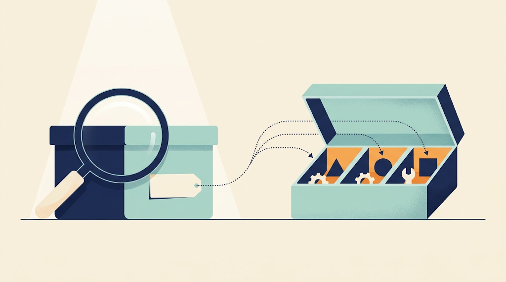
The key is that the user can discover the action without committing to it. The icon is an invitation to ask, “What does this button do?” The UI should answer that question before the user has to take any risk.
Let users ask, “What does this button do?”
Most of us have used software where we were afraid to click a button because we did not know what would break. That fear does not come from the button itself. It comes from the absence of information.
In the accounting app, the user could hover, see the lock, and click it. The click did not immediately close the period. It opened a small confirmation dialog that explained the action in business terms: “Soft close this period?” The user could read it, understand it, and decide. If they did not want to proceed, they could cancel and go back to exactly the state they were in.
The click starts a conversation, not an immediate action. We are letting the user explore safely. They can satisfy their curiosity without paying a price for being wrong.
This matters most for users who are not accountants by training. Maybe they were trained last week, or maybe they only close periods once a quarter. The software should not assume they carry the whole business model in their head. It should carry it for them and show it when it matters.
Show downstream effects: closing 2022 affects 2021
The strongest help is showing consequences the user cannot see from their current screen.
When the user is looking at fiscal periods for 2022, the screen does not show 2021. They are focused on the current year. But the business rule behind the action knows that locking 2022 means all preceding periods, including the ones in 2021, must also be locked. The code has access to that data. The user does not, because they are not looking at it.
So when the confirmation dialog opens, it clarifies the consequences of continuing with the action:

That approach turns a hidden side effect into a visible choice. The user might say, “Wait, I did not mean to touch 2021,” and dismiss it. Or they might say, “That is exactly what I need. I’m glad I don’t have to close each period individually,” and confirm. Either way, they are making an informed choice.
This is the same spirit as surfacing why a button is disabled. There, we exposed the rule. Here, we expose the outcome. Both are ways of taking what the code already knows and turning it into something the user can use.
Default to dismiss; let users back out once they see the consequence
One detail we were careful about on this screen: the default button is Dismiss.
That matters because users read confirmation dialogs in a hurry. They move fast, press Enter, and expect the safest thing to happen. If Enter confirms the close and affects 2021, we are forcing them to commit before they have had time to absorb the message. If Enter dismisses, they can read, pause, and then deliberately click the Confirm button.
The point is to give them a way out once they see what will happen. The dialog is a safety net. The user clicked the lock to find out what would happen, and now they see the full picture. If that picture is different from what they expected, Dismiss should be the easiest path.
I have seen the opposite pattern many times: a confirmation dialog with the destructive action pre-selected and the confirm button styled in the brightest color on the page. That design tells the user to keep moving forward. In accounting, and in most business apps, forward is not always the right direction. Let the user back up.
What the developer does differently
From a coding perspective, this is a code design problem, not a front-end styling one. The back end already has the rules that determine whether a fiscal period can be closed and what happens when it is. We already wrote that code. The only question is whether we push the consequence description to the UI along with the boolean.
The same rules engine can now return both the reason a button is disabled and the outcome if it is enabled. The message travels from the business rule to the API response to the screen, so the user sees the consequence before committing.
Because the rules are isolated, we can also make them context-aware. Maybe an accountant admin sees the full impact. Maybe a junior clerk sees a shorter version. Maybe the message changes based on the user’s language. We are not hard-coding strings deep in a controller. We are exposing the rules the system already understands.
That is the developer’s job. We are not being asked to become UX designers. We are being asked to stop treating the user as a black box that receives our data. The user is a person with a question, and our code has the answer.
Pretty useful means users can afford to be curious
Take the phrase “make software pretty useful.” One reading is that the software should look good enough to invite people in, and be useful enough to keep them. The “explore safely” pattern does both. It makes the interface feel calm because the user knows nothing bad will happen by accident. It makes the software useful because it turns hidden business rules into visible information.
When users can see the impact of an action before they commit, they stop tiptoeing around the interface. They click, they learn, they decide, and they move on.
They can skip the support call and the extra screen. The software answers the question before they finish asking it.
Once a user can act safely, the next question is how they find the right action in the first place. Organization and navigation handle that.



Leave a Reply