
A sales rep was taking a customer call. She opened the wrong sales order, muttered, “Let me cancel this,” and the customer on the line panicked. “No, I don’t want to cancel my order!” The rep had to backpedal. She did not mean cancel the order. She meant close the dialog.
On that screen, Cancel was doing two jobs at once: a screen action and an order action. The customer heard the real-world meaning. The rep meant the technical one.
It is a small thing until it is not.
Buttons Are Verbs, So Use the Right Ones
A common pattern in most software is the same three buttons at the bottom of every screen: Cancel, Delete, Save. They are easy to reach for, but they are also the wrong words for most actual work.

A customer calls and says, “I need to cancel my order.” The company has a real process for that, so the label should read Cancel Order. That is what the person wants to do. But the button that closes the screen without saving should be Dismiss or Discard Changes, because it only closes the screen.
Delete is worse. Nobody calls a company and says, “I would like to delete my order.” Delete is what happens to rows in a data store; it is not a word anyone uses with a customer. If a product is no longer sold, the business calls it discontinued. Label it Discontinue Product. If an order is no longer wanted, the button should reflect that outcome, not a storage operation.
Save is the quiet one. Save means “persist this to permanent storage.” Users do not say that. They say, “I’m ready to place my order,” or “Send this to the warehouse,” or “Invoice this order.” Use Place Order, Ship This Order, or Invoice Order. The label names the job the user is doing.
A better name is more than a coat of paint. It changes what the user expects and how we model the code. When the button says Ship This Order, the backend command can be ShipOrder. The UI, the tests, and the API all speak the same language. I wrote about this connection between words and code in Code Is for Humans (and AI): Write to Communicate.
Credit Sales Terms: From Cells to Sentences
The same idea shows up in places that do not look like buttons. On the credit sales terms screen, we needed to collect discount terms: a percentage and a number of days. The easy path is two cells in a grid. One cell holds 10. Another holds 5. The user has to read the headers, remember which is which, and mentally translate.
We can do better.
During data entry, the screen reads like a sentence:
Discount terms offered: 10% off when paid within 5 days.
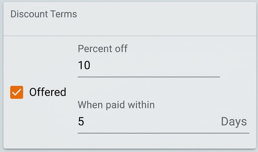
The two numbers are still editable, but the sentence carries the meaning. The user does not have to wonder, “Is that 10 percent? Is that 5 days or weeks?” It makes the meaning immediate.
Once the record is saved, the read-only view keeps the same shape. It does not collapse back into 10 and 5. It still says 10% off when paid within 5 days. We bold the values because those are the parts a distracted user needs to scan.

I wrote about this before in The Spreadsheet Question. Spreadsheets (which many people say is what they want, even though it’s not what they need) are great for exploration, but a warehouse worker, a call-center agent, or an accountant on a deadline needs a sentence that matches the policy they need to confirm.
This is another place where clean UX and clean code travel together. A UI that reads like a sentence is easier to test. A test can say, “Given discount terms of 10 percent within 5 days, the summary should read…” That description becomes a Given-When-Then scenario the product team can read.
“See More,” Not “Load More”
A few years ago I was reviewing a list of color options. The list was long, so the developer added a button at the bottom: Load More. It made perfect sense to the developer. “When they click here, we’ll call the API and load more records.”
The user is looking at a short list of colors and wondering, “Can I see more?”
The same pattern shows in several applications and websites.
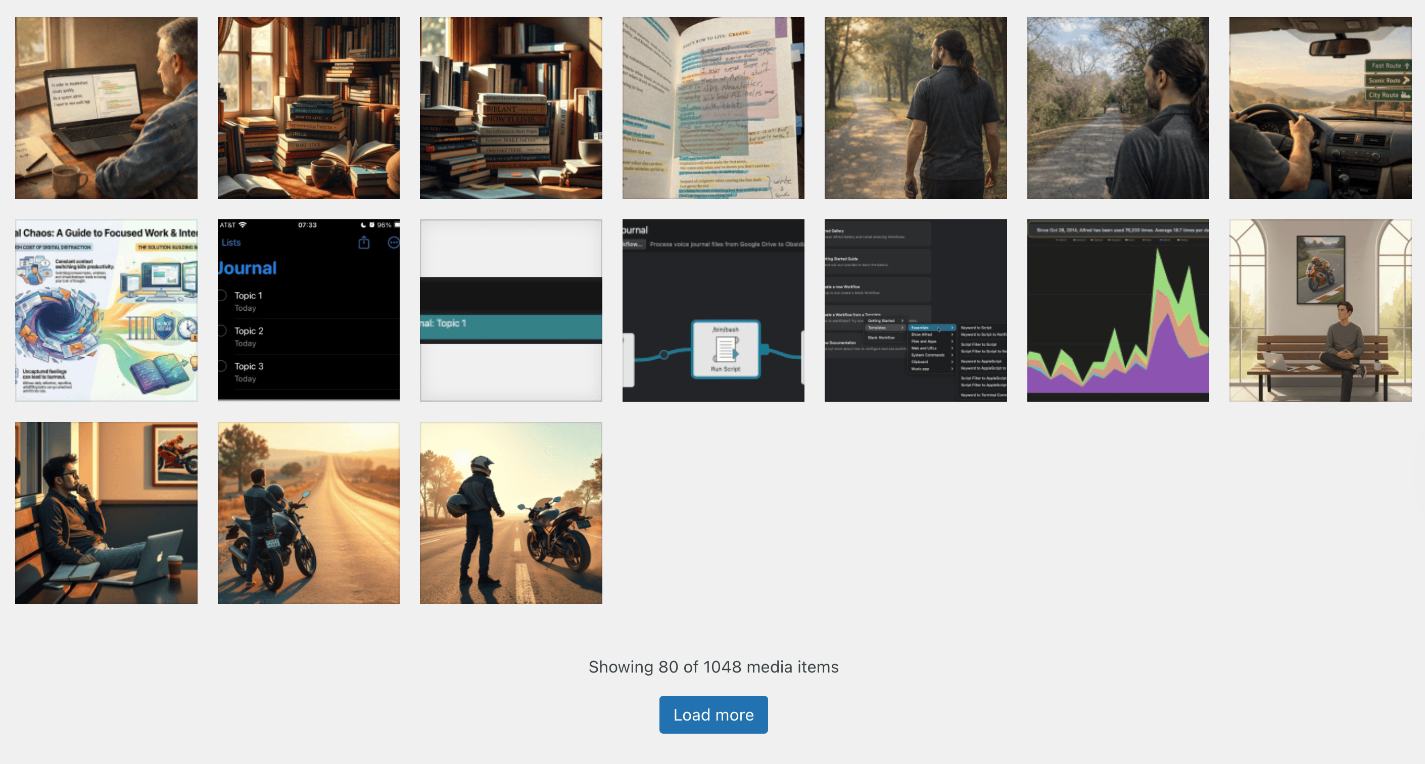
So call the button See More. If the user wants the opposite, it can say See Less. Load More is a description of the implementation. See More is a description of the user’s intent. The same pattern shows up in search results, in category lists, and in autocomplete. When in doubt, phrase the button as the user would phrase the question.
That is the move from data-first to task-first language. I have been writing about this shift to task-based UIs. The words we put on the screen are the first signal of whether we are building for a task or for a table.
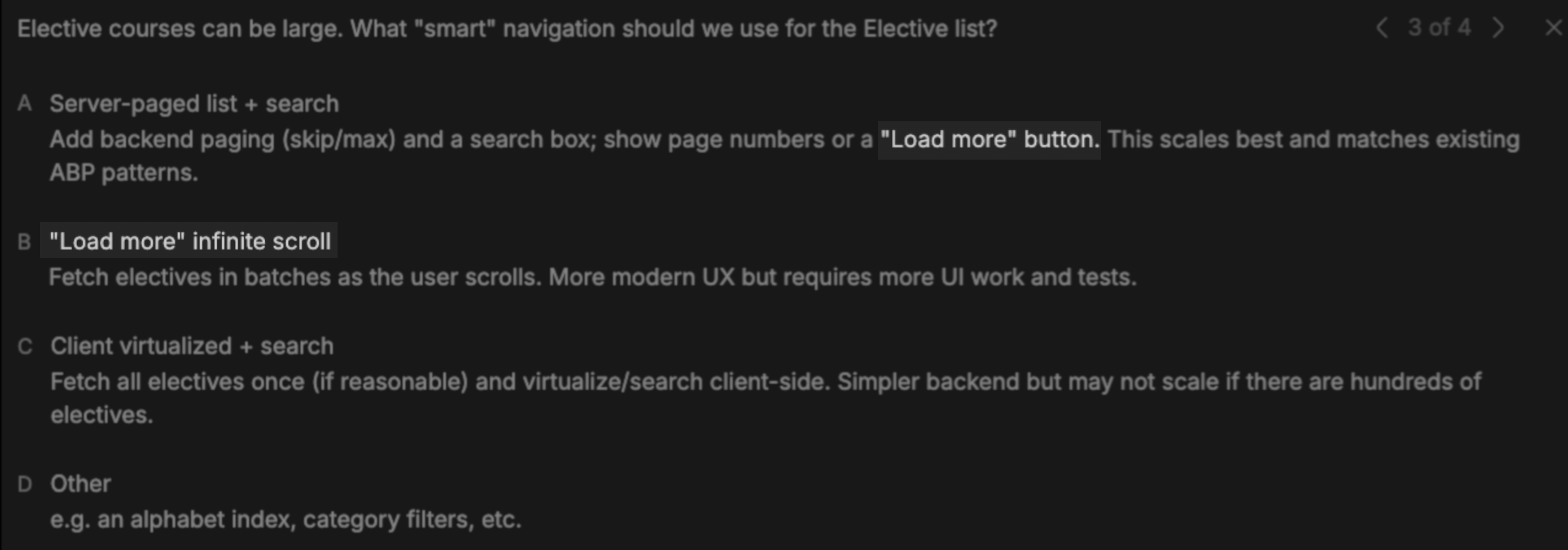
As I pointed out in AI Starts at the Average — You Take It From There, the average suggestions we get from AI also push us towards the “Load more” anti-pattern, so beware:
Language Is a Navigation Tool
Once the system knows the user’s role and task, it should also speak in that user’s language.
An accountant looking at fiscal year data and a warehouse worker adjusting lot counts do not use the same vocabulary. The accountant thinks in periods, closes, and lock dates. The warehouse worker thinks in cases, pallets, and broken stock. Both need the same underlying data sometimes, but the labels should match the job at hand.
Right words matter more than simple words. The same word in two contexts can mean different things. In sales, “order” means a sales order. In purchasing, it means a purchase order. If the screen uses the wrong one, the user will either misread it or spend extra cycles translating. I explored this in Why I Think Hard About the Right Words and Most Developers Speak with a Thick Technical Accent.
When the labels match the user’s language, the UI feels obvious. That is the point. Obvious is respectful. It never wastes the user’s time.
The Developer Angle
All of this lands on the developer’s desk. Designers can suggest labels, but the labels are wired into the code. They appear in view models, in API contracts, in validation messages, and in tests.
If your code says DeleteProduct but the button says “Discontinue Product,” you still have a translation layer inside your own system. That is where the bugs live. A user clicks Discontinue Product, the backend removes a row, and six months later someone asks why the history disappeared. The word and the action drifted apart.
I prefer to let the language of the business drive the code. The button says Discontinue Product. The command is DiscontinueProduct. The test says “when the user discontinues the product.” The validation message says “This product has already been discontinued.” If the domain actually says “Deactivate Account” for a customer, then the button, the API command, and the test all say DeactivateAccount. One word, one meaning, everywhere within the same context.
That requires asking the people who do the work what they actually say. It also requires not settling for the first technical verb that comes to mind. Create, update, and remove describe storage operations. Place, Ship, Invoice, and Discontinue describe real work. The closer the code stays to those words, the easier it is to reason about and the easier it is to maintain.
Users Are Not the Problem
It is tempting to think, “Users just need to learn the system.” But that is the wrong starting point. Users are distracted, stressed, and short on time. When someone is on the phone with a customer, or counting cases in a noisy warehouse, or trying to close the books by 5 p.m., they do not have spare brain cycles to decode our vocabulary.
Natural language reduces cognitive load. It says to the user, “We know what you are doing here, and we will use your words.”
The credit sales terms screen is a good example. We could have defended the two-cell grid by saying, “Percentage in one column, days in another; it’s obvious.” That is true when you are staring at it in a demo. It is less true when you are juggling three other tasks and someone is asking why the discount did not apply.
A sentence that states the actual terms, with the important numbers bolded, removes that load. The user scans it, sees 10% and 5 days, and moves on. The work moves from cells to sentences to actions without the user having to stop and reword it.
Labels That Invite Progress
When the screen uses the right words, we can stop demanding every answer before the user starts.
If the interface speaks the user’s language, the user is more likely to trust it. If the user trusts it, they are more willing to enter what they have now and finish the rest later. They can see what will happen: the button says Review and Continue, or Continue Later, or Submit to Warehouse. The label sets the expectation.
That trust matters when users do not have all the information. Which is most of the time. Workflows should take what users have and let them finish later. Forcing them to have everything first is the trap.
Speak Human
I think back to the sales rep and that Cancel button. One wrong word created a moment of panic. One right word could have made the moment invisible. That is the kind of software I want to build: software that reads so naturally the user forgets the interface.
Pretty useful software is clear and valuable. It lets users act without translating or guessing. It speaks human.



Leave a Reply