A year ago, I fed user stories into Cursor for the first time and watched something functional appear before me. That moment stuck with me — not just because of the tool, but because of what it set in motion. Fast-forward to today, and Matthew and I found ourselves looking at AI tool dashboards and asking a question that applies far beyond developer tooling: does the information on this screen actually help anyone?
This episode of Reflective Practice Radio started with a one-year anniversary and turned into a deep dive on dashboards, cockpits, and what it means for the data we display to truly earn its place.
A Year of AI-First Development
It started with a five-year journal entry. Exactly a year ago, I was surprised by what Cursor could do — taking a user story and producing something real. That was the beginning of a shift in how I work.
Since then, the tools have changed. In the last three weeks, I switched from Cursor to Windsurf exclusively on one project, just to experiment. Both tools track usage data. Both offer dashboards. And both left me asking the same thing: what does any of this actually tell me?
That question — what does the data tell me — is the thread that ran through the entire conversation.
Who Pays for the Tokens
Matthew brought up something that doesn’t get discussed enough: the economics of AI-assisted development.
We’re using shared token pools provided by our organization. The tools make our work easier, reduce cognitive load, and eliminate a lot of the exhausting syntax-chasing and bug-hunting that used to eat up hours. That’s an improvement in quality of life. But the company is bearing the cost — and as more work gets offloaded to these tools, the bill grows.
The conversation got interesting when we started pulling apart cost and value. A lot of people think about cost in isolation. But cost without value is meaningless. My perceived value of a tool might be sky-high even if someone else looks at the price tag and flinches. That difference in perspective is exactly the kind of thing a smart dashboard should help surface.
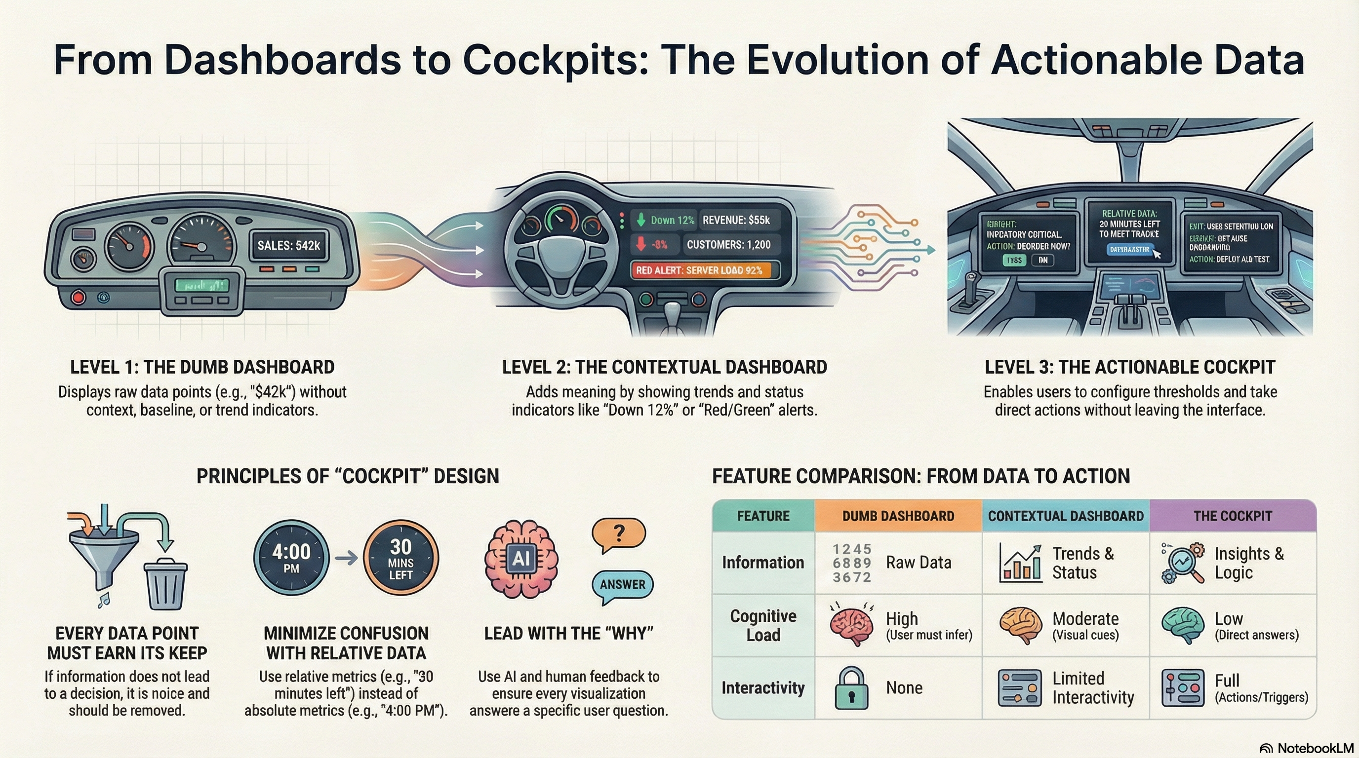
Dumb Dashboards, Better Dashboards, Cockpits
I had recently written a blog post about dashboards vs. cockpits and built a small demo app to illustrate the concept. We walked through it together.
The dumb version shows numbers: total revenue, active orders, and a few cards. You look at it and think, 42K looks big to me. But is it good or bad? No idea.
A slightly better dashboard adds context. It tells you that revenue is down 12%. Now you know where to focus. Red means attention is needed. Green means move on. That’s already a huge improvement — but it still doesn’t let you do anything.
The cockpit approach goes further. You can configure thresholds. You can drill into the details. You can take action — reorder inventory, resolve a quality issue — without leaving the screen. See, understand, act. All in one place.
What Windsurf’s Dashboard Told Us (and Didn’t)
We pulled up Windsurf’s usage dashboard live and went through it together.
Some things were validating. The data showed that 99% of the code was written by Cascade (the AI agent), not by me manually. That matched my experience — I’ve barely touched code directly for months. Tab completions were almost entirely Markdown, which makes sense given my blogging automation workflow.
But a lot of the dashboard fell flat. “Total ACUs used” — what’s an ACU? AI Compute Units, apparently, but the dashboard didn’t explain that. “Terminal messages sent: 2,820” — okay, and? “Commands used: 0” — what even counts as a command versus a workflow?
Matthew put it well: a lot of this exists because they’re tracking it, not because there’s a real use for us.
Every Metric Should Earn Its Position
This is where the conversation sharpened. Matthew said something that stuck: if it’s going to live on this dashboard, it has to earn its keep.
Take “Cascade model usage.” It showed I use Claude Sonnet 4.5 far more than Opus 4.6. Someone looking at that might assume Sonnet is better. But it’s not — Opus outperforms it in most measures. The real reason might be cost, or defaults, or habit. The chart doesn’t tell you any of that.
Even the model selection UI falls short. Both models show three dollar signs. Both show the same context window. So how do you choose? The only differentiator visible to the user is the version number — and 4.6 must be better than 4.5, right?
That’s the trap of pretty dashboards. Everything looks polished. The bars animate. The layout is responsive. But when you put it under a microscope, the value shrinks.
Minimizing Confusion
We landed on a phrase that captures the design goal: minimize confusion.
The Amazon example came up naturally. When you’re about to order something, Amazon doesn’t show you a server timestamp and expect you to do timezone math. It says, order within the next 30 minutes. No confusion. No mental overhead.
I shared a story about being in Europe years ago, working on Houston time while my computer hadn’t synced to local time. My brain broke. I was living in one timezone, working in another, and the screen was showing a third. I couldn’t perform.
The system had all the information it needed to resolve that confusion. It just didn’t. And that’s the point — when the system has the data, it should do the work for the user, not push it onto them.
Leading with Why
The conversation kept circling back to one thing: why.
Somewhere, somebody decided to put “terminal messages sent” on that dashboard. They had a reason — or maybe they didn’t. Maybe an AI generated the layout, and no one questioned it. Matthew raised that possibility, and it’s worth sitting with.
My approach has been to lead every conversation with the need. This is the problem. This is why it matters. Here’s the data we’re tracking. Now — what would you suggest, and why? That applies whether I’m talking to a stakeholder or prompting an AI tool.
When we skip the why, we end up with beautiful screens full of numbers that no one uses.
Humans Still Win Here
Matthew made an observation near the end that I keep thinking about: AI will display the data all day long, but the users who look at it and have questions — those are the answers we need.
AI isn’t using these tools. It doesn’t know what it feels like to see a number and wonder if it’s good or bad. It doesn’t have the internal context that a salesperson brings when they glance at a revenue figure. That human reaction — wait, that doesn’t look right — is exactly what should drive the next version of the dashboard.
The trick is capturing those reactions, those questions, and feeding them back into the design. That’s something I’ve been doing deliberately: showing people the “dumb” version first, watching their reactions, recording the conversation, and then using that as input for a better design.
What’s Next: Blog Posts as Applications
Right at the end, Matthew floated an idea that lit up the conversation: what if each blog post was also an application?
You’d start reading, scroll down, and suddenly you’re interacting with a live demo. The dumb dashboard, the better dashboard, the cockpit — all embedded right there in the post. Text, video, interaction, all woven together.
I’ve already been moving in this direction. I built the dashboard demo in AI Studio from one of my blog posts. The next step is embedding those directly. We might have a demo to show next week.
If any of this resonated — the dashboard-cockpit distinction, the question of whether your metrics earn their place, or just the idea that data without context is noise — I’d encourage you to watch the full episode. The conversation itself has a lot more texture than any summary can capture.


Leave a Reply