Navigation in a large application looks deceptively simple. Open the sidebar, see the items, click one, go there. Done.
But the design behind that navigation, and whether it was built to evolve or resist change, is where things get interesting.
The Problem I Kept Seeing
Back in 2010, I was working on a desktop application built with WPF, where the menu was defined entirely in XAML. Each item came with its label, its icon, and its click handler, all baked into a single UI component. It worked fine, until requirements changed.
Add a new top-level menu? Change the component. Reorganize a submenu? Change the component. Add permission filtering? Change the component.
Every addition required modification. That’s a textbook violation of the Open-Closed Principle. I wrote about it at the time, and later published a post in 2017: A Good Example of Open-Closed Principle.
The principle says: software entities should be open for extension but closed for modification. We want to add to the menu without touching the code that renders it.
What the Solution Looks Like
The fix is to separate the what from the how. The rendering component should only know that a menu exists. It accepts a list of items and displays them. It doesn’t know what those items are, what labels they carry, or what they execute.
That responsibility moves to a menu builder. The builder knows how to gather items from different modules. Each module knows its own items. When a new module is added, the builder doesn’t change; it just gets a new dependency to ask for items.
Central execution (the thing that runs when a user clicks a menu item) also becomes a single point of extension. Want to log every menu action? Add it there, once, and every click gets it.
Taking It Further: Server-Side
In another project, this pattern grew well beyond what I had in 2010. Here, the menu is defined entirely on the server side, in a YAML file embedded in the API assembly.
That YAML is compact and readable. No curly braces, no noise. Just the structure: names, labels, frontend routes, icon names, permission tokens. It reads almost like documentation.
When the user logs in, the server reads that YAML, deserializes it into objects, filters it down to what the authenticated user can see, and sends the result to the frontend. The frontend stores it in a local state store and never asks again during that session.
The frontend doesn’t decide what’s in the menu. It doesn’t filter by permissions. It renders what the server sends. That’s deliberate.
When permissions change on the server, the menu reflects it at next login. When we reorganize the hierarchy, add a new section, or rename a label, that’s a backend change. Deploy it, log back in, and the frontend just works.
Permissions That Roll Up
There’s a detail worth explaining: aggregated permissions.
Say a user only has permission to record a received invoice. That action lives three levels deep in the hierarchy, under Accounts Payable, under Invoices, under the specific action. For the menu to display that path correctly, the parent items also need to be visible.
The server handles this by recursively aggregating permissions up the tree. Each parent node collects the union of all permissions from its descendants. Even if a parent node has no permission token of its own, it stays visible as long as any descendant is accessible to that user.
That’s what the aggregatedPermissions field in the API response captures. It tells the frontend: show this parent, because there’s something underneath it the user can reach.
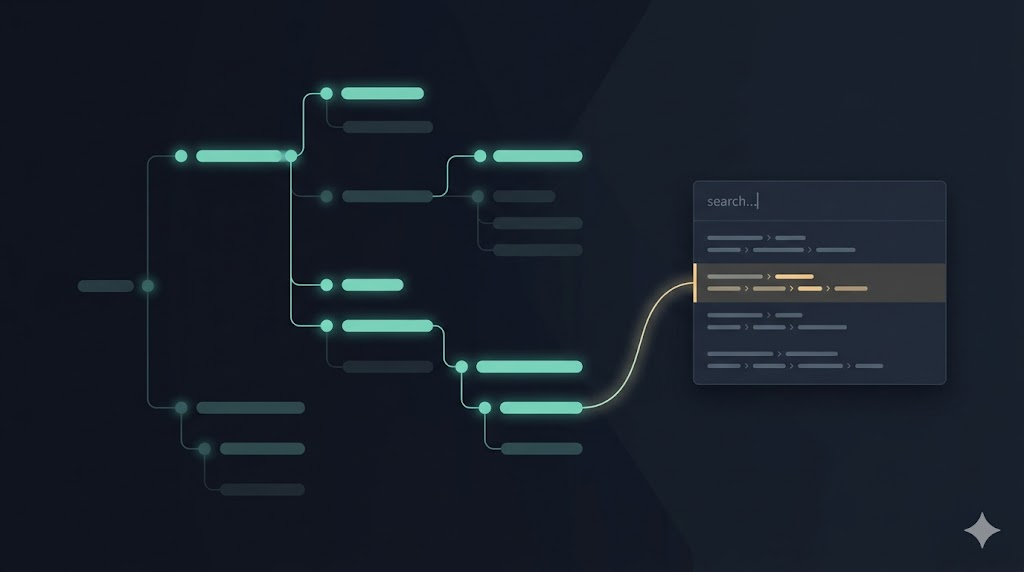
Finding Things Without Knowing Where They Are
One of the most useful features built on top of this menu structure is the application search bar. Users in a large system often know what they’re looking for but not where it lives. Is it under Sales or under Accounts Receivable?
The search works by flattening the same menu hierarchy and scanning through the names of all items the user can access. Type “payment” and you get: Approved Payments under Accounts Payable > Invoices, the Payments list under Accounts Payable > Payments, Outstanding under Accounts Receivable, and so on.
Click a result and the app navigates there. Over time, users also learn the structure by seeing where results come from. It’s progressive disclosure: you learn the menu by using the search.

AI Helped Close Some Gaps
A few days ago I spent time with an AI assistant reviewing the documentation and tests for this menu system. I started from sparse docs and asked it to analyze the full implementation (both frontend and backend), ask me clarifying questions, and help me produce comprehensive documentation.
Then I asked it to identify test gaps.
It found one right away: a filtering scenario where a user with only a grandchild-level permission should still see all ancestor groups. The test didn’t exist, and neither did the correct behavior in the production code. The assistant wrote the test, watched it fail, fixed the production code, and ran the full suite to confirm nothing broke.
It also found a dead class, a query that was no longer used anywhere. Confirmed unused, removed, all tests still green.
There’s something satisfying about an AI pairing session that catches bugs you didn’t know you had, removes code you forgot to delete, and documents how the system actually works, all in the same conversation.
A System Ready for What’s Next
The current architecture already supports something I haven’t built yet but can see clearly: user-customizable menus. Because the source of the menu structure is pluggable (currently a YAML file embedded in the compiled API), it could just as easily be a database record or a file loaded from Azure Storage, merged with user preferences at runtime.
Permission filtering would still apply. The rendering logic wouldn’t change. The extension point is already there; it just hasn’t been wired to anything yet.
That’s the payoff of following the Open-Closed Principle. You don’t know exactly what you’ll need to extend in the future. But if you build with extension in mind now, it’s not a rewrite when the need comes. It’s just adding.


Leave a Reply