What Sparked This Post
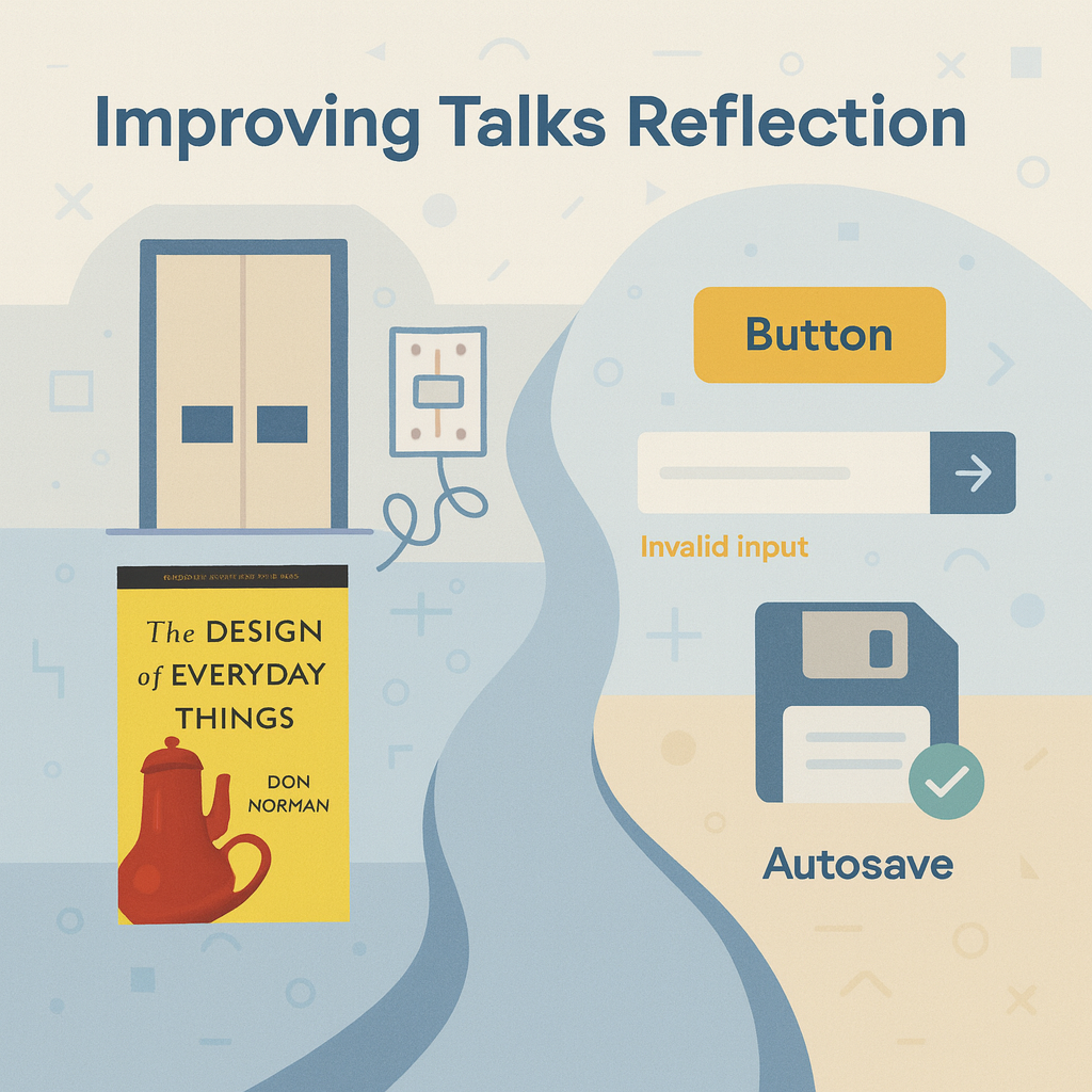
I’m revisiting a past Improving Talk by Denny, smartly titled Improving Software Design with Everyday Things, in which he explored Don Norman’s book The Design of Everyday Things (DOET) and what it teaches us about building better software. The examples of doors, faucets, and light switches reminded me of the frustrations we’ve all faced, and how often we silently blame ourselves instead of the design itself. Listening brought me back to my own talks and writings on UX and UI design, especially my post on Don Norman’s book, and reinforced ideas I’ve been sharing with developers for years: UX is not about making things look pretty. It’s about making them useful.
What the Talk Was About
Denny walked us through Don Norman’s core concepts:
- The Gulfs of Execution and Evaluation: the gap between what people want to do and what the system tells them happened.
- Design tools, such as affordances, signifiers, constraints, mappings, and feedback, help close those gulfs.
- Conceptual Models that let people carry simple, portable mental models across systems (like gas and brake pedals).
- Designing for Error and Interruption: Expect Mistakes, Preserve State, and Support Undo and Recovery.
- Human ⇄ Machine Collaboration: leverage human creativity and context with machine precision and memory.
Why It Resonated With Me
In my own talks, I’ve pushed back against the myth that “UX = making things look pretty.” I’ve demonstrated how messy UX often accompanies messy code, while great UX drives clean UI, and typically yields cleaner, testable code. Denny and I were teammates when he created this talk, after we both participated in a book club for DOET. Unsurprisingly, Denny’s talk felt like a companion to mine, reinforcing those lessons with Don Norman’s vocabulary.
A few highlights:
- Error = partially completed task. I love this framing. It aligns with my practice of anticipating and compensating: surfacing the “why” behind a disabled button or failed action instead of leaving users in the dark.
- Interruption-aware design. I’ve been saying for years: users aren’t living in our apps all day. They’re juggling customers, distractions, noise, and deadlines. Autosave, undo, and recovery are ways of respecting their real context.
- Human ⇄ machine strengths. This echoes how I think about AI: people provide insight and sense-making, while machines provide recall and precision. Our job as designers and developers is to bridge those strengths.
What I’m Still Thinking About
Denny’s framing reminds me to revisit how I talk about error handling and notifications:
- How often do we still dismiss problems as “user error” when the design itself failed?
- Could we reduce support calls by surfacing reasons in the UI instead of hiding them in code?
- Are our notifications role-aware, contextual, and actionable, or just noisy?
It also makes me think about conceptual models that outlast technology shifts. Just as drivers carry gas/brake understanding across internal combustion engine (ICE) and electric vehicles (EV) cars, what conceptual models in our systems will carry over to the next platform shift (AI-driven, voice, augmented reality (AR))?
Want to Watch It?
Watch Denny’s Improving Talk here.


Leave a Reply