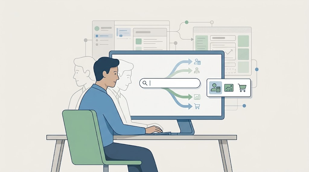
Business systems grow. A menu works well for a small application, but once it has hundreds of features, it becomes a trap. Users know what they want to do. First they have to remember where we hid it. Let them say what they are trying to do.
The Menu Is a Trap
A menu is a reasonable way to organize a small application. With ten screens, grouping them by function is fine. With a hundred, it becomes a memory test. Users have to know that “close fiscal year” lives under General Ledger > Period End > Closing, instead of just typing “close the fiscal year.”
A menu can be technically correct and still useless when the right task is buried. Someone under pressure needs the fastest route to the task. A perfect org chart often slows them down.
One Person, Many Roles
At a large company, one employee often has one role. The UI can match that role. At a smaller company, one person can be an accountant in the morning, a salesperson in the afternoon, and a buyer later the same day. The system should treat them as one person doing several jobs.
In complex systems, each person has several permissions. If we showed them every screen they were allowed to open, the interface would overflow. Sales orders, purchase orders, invoices, payments, receipts, and inventory adjustments all within reach. No one sits down to see every screen they own. They sit down to do one job.
They needed the features to perform tasks for the role they were in right then. The system should ask, “What role are you playing now?” They could switch from accountant to salesperson to buyer, and the UI would reshape itself. The menu shrank. The toolbar changed. The home screen showed the tasks most likely for that role. The interface followed when they switched roles.
This changes more than the menu. It changes the context. The search box stays at the top, but its suggestions shift with the role. The dashboard shows pending work for that role. The forms preselect defaults that make sense for that task. A salesperson sees customer names first. An accountant sees the general ledger first. A warehouse worker sees lot numbers first. In many cases, same data, different intent.
Search for the Task
Even a role-based menu can grow large. An application search box at the top of the screen allows users to type what they are trying to do.
A user types “order.” If they were only in the sales role, the search took them straight to sales orders. If they had access to both sales and purchasing, the search paused and asked, “Did you mean a sales order or a purchase order?” That one word replaced several clicks through nested menus.
The search matches tasks, ignoring screen names. “Order” matches the task of working with an order, no matter what the menu label says. It uses the role to narrow the match and permissions to filter what to show. Purchasing only appeared if the user has permission for it.
A user can type “order #123” and go straight to order 123. No menu, no grid, no search screen, no submit button. The system would parse the intent, resolve the entity, and take them there. They can put the map away. The system meets them where they are.
Natural language is messy. “Order” can mean many things. The system uses their current role and permissions as context. When the input is ambiguous, it asks for clarification.
Code from Context and Intent
The UI change is visible. Underneath it is an architectural decision. The user’s current role becomes a piece of application state. Permissions become first-class rules. The menu is generated from the user’s context. Search is an intent layer that routes tasks.
The code I want to see has one place that answers, “What can this user do right now?” and one place that answers, “What is this user trying to do?” The rest of the UI is generated from those two answers. When the user changes role, the context changes and the interface re-renders. When they type in the search box, an intent resolver maps their input to the tasks they are allowed to perform.
A result from the resolver might carry a handler, a route, and an optional entity ID. The client passes “order #123” to the resolver and follows the task that comes back. If the user types something ambiguous, the resolver returns a short list of allowed options, and the UI asks them to pick.
The Same Idea, Bigger
500 Screens, One Idea: What Users Actually Need applies the idea to screen design. One task-focused screen matters more than faster popups. That principle works here too. A system that routes by intent matters more than a better menu.
Two earlier posts cover the menu itself: a menu system built for change and the code underneath it. The menu itself is a guess at the user’s intent.
Role Is Only Half the Conversation
Making software pretty useful means getting users to the right place without forcing them to memorize the map. When one person moves from accounting to sales to purchasing in one day, the system should move with them. A role switcher, an application search box, and a few well-defined rules make that easier than the most carefully organized menu.



Leave a Reply