
A hospital client once asked me to rebuild a system that had around five hundred screens. Their plan was straightforward: recreate the new application with the same five hundred screens, the same layouts, and the same behavior. After all, that was what the users were used to.
That assumption cost them more than they knew.
The archaeology of a bloated screen
The typical screen in that system was a CRUD form. At the top, some fields. At the bottom, a grid with close to a hundred columns. The grid pulled thousands of rows. The user scrolled, clicked a row, and a popup opened. Inside that popup was another grid. Double-click a row there, and another popup opened. After three or four levels of popups, the user might find what they were looking for. Or they might realize they clicked the wrong row, close everything, and start over.

Each popup could take thirty seconds to a minute to appear. The database was cluttered, the queries were heavy, and every level of nesting triggered another expensive load. The users had learned to live with it. Some kept a cup of coffee nearby. Others memorized sequences of clicks. But they were not happy.
The client saw this as a performance problem. They wanted faster popups. The UI had been built around the structure of the data, not what the users were trying to do. Faster popups would not fix that.
Asking what the user is trying to accomplish
I started asking the same kind of questions I ask now. When a user opens this screen, I want to know what they are looking for, what decision they are trying to make, and what they do with the answer.
It turned out that most users did not need five hundred screens. They needed to answer a small set of questions about cost centers: what is the status of this cost center, what tasks or reminders are attached to it, and what does the trend look like. Those answers were scattered across dozens of popups because the original system had been grown one screen at a time, each one bolted onto the data model.
We threw the five hundred screens away and built one.
One screen, composable answers
The new screen had a simple structure. On the left, filters and navigation. The user could search and select a cost center. In the center, a hierarchical grid showed the cost centers and their related data. At the bottom, tabbed panels held the cost center’s details. To the right were the related to-do items, reminders, charts, and other related information.
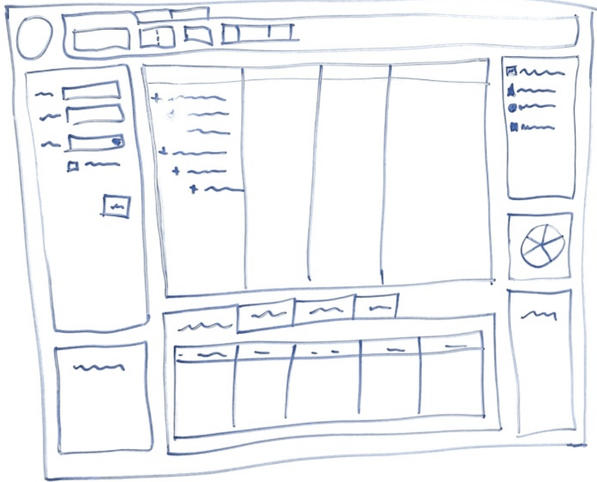
The key was the loading, not the layout.
We did not load everything at once. The top-level data came in immediately, because that was what the user needed first. The first detail tab loaded once the user settled on a row. The other tabs waited. If the user never clicked a tab, we never paid for the data. When the user moved quickly through the grid, we did not fire off a request for every row. We waited half a second, enough for the user to settle, and then we fetched the details.
We also prioritized based on what users actually looked at first. For cost centers, the first thing they usually wanted to see was reminders and open tasks. Then the chart. Then the deeper detail grids. By ordering the work this way, the screen felt immediate even though the data was still large.
We put the prototype in front of stakeholders without a manual and without training. They were using it without help very quickly. The thing they had struggled with for years was suddenly obvious.
What “used to it” really means
The client had wanted to replicate the old screens because the users were “used to them.” But being used to something is not the same as needing it. People get used to all kinds of bad experiences because they have no alternative. They memorize workarounds. They build rituals around the pain. When you ask them what they want, they describe the pain in the language of the current system.
That is why I ask users what they are trying to do, not what screen they want. The screen is a means; the task is the end.
This is the same idea I wrote about in From Conversation to Clickable: Using AI for Task-Based UI. The tool changed, but the move is the same: start from the human moment, not the CRUD table. AI makes the prototype faster, but the conversation is still what matters.
Performance was the wrong diagnosis
The slowness was real, but it was a symptom. The database queries were slow because they were pulling more than the user needed. The popups were slow because each one loaded an entire world of data. The hundred-column grids were slow because no human reads a hundred columns at once.
In User Experience Is Every Developer’s Responsibility I argued that back-end decisions land on the user as frustration. This project is an example. The queries returned data, but they buried the answer under minutes of waiting.
I also wrote in Revisiting 2007: Four Screens, FoxPro Farewells, and Lessons on Focus about how easy it is to confuse many screens with progress. This hospital system was the extreme version of that mistake.
What stayed and what went
We did not automate the migration or convert the old screens into new ones. We replaced them with a single, task-focused screen. The data stayed. The business rules stayed. The database mostly stayed. The only thing we threw away was the assumption that the old UI was the right UI.
That is the central lesson of this project. The value of a rewrite is permission to ask what the user actually needs, not that the technology is newer. If you skip that question, you are just building the old pain faster.
This is a post in the series “The Software Does Not Work – Rewrite It: Lessons from Two Decades of Replacing Legacy Software.”
- The Software Does Not Work – Should We Rewrite It?
- The Floppy Disk Handoff: When the Source Code Lies to You
- A 24/7 Operation: The Rewrite That Didn’t Need to Stop the World
- 500 Screens, One Idea: What Users Actually Need – This post
- There Is No Domain (Yes, There Is): Pipeline Inspections and the Dynamic App
- Why Calling FoxPro Forms from .NET Hurts
- When Silverlight Died, We Didn’t: The Thin UI Bet
- Excel in the Browser: A Rewrite That Never Launched
- A Year and a Half Without a Database
- What I Still Believe About Software Rewrites



Leave a Reply