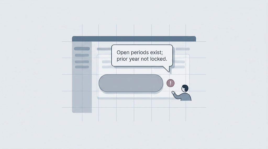
Every boolean in your code is a question the user might be asking. Answer it in the UI.
Take an accounting module as an example. A user opens the fiscal periods screen, chooses the year they wanted to lock, and sees the Lock Fiscal Year button grayed out. No message, icon, or hint told them what was wrong. The user has no idea why.
You have stared at a disabled button and wondered why it will not let you through. In accounting, locking a fiscal year matters. Once the books are filed, you do not want anyone posting transactions into the prior year. The user comes to the screen ready to lock the year, and the software says no without saying why. That is a support ticket waiting to happen.
The User Is Distracted
Users are distracted. They may be an accountant trying to finish month-end before lunch. They do not have the mental bandwidth to reverse-engineer your business rules by staring at a gray button.
The problem gets worse when the button is clickable, the user fills out a form, hits Submit, and only then learns the action is rejected. The software knew. It made the user guess anyway. The rule is right there. Show it on screen too.
Anticipate and Compensate
A design principle I learned is to anticipate and compensate.
Anticipate the questions a user would ask if you were sitting next to them. Compensate because you are not beside them. You cannot see the confusion on their face, and you cannot ask what they are trying to do. The software has to do that work.
Every if statement asks a question. if (precedingYearIsLocked && noOpenPeriods && userHasPermission). Users do not see that expression. They are asking the same thing: why is this locked? The code has the explanation. The UI should show it.
The Fiscal Year Lock
On the fiscal periods screen, when that button is disabled, we show a small icon beside it. Hover, and the tooltip says:
There are fiscal periods in open status; the previous fiscal year has not been locked.

The message states the business rule in business language. It tells the user exactly what is in the way: open periods exist, and the previous year is still unlocked. The user can act on that information. They can close the open periods, lock the prior year, or talk to their supervisor. They skip the support call.
The accounting team recognized it immediately. The icon saved them from guessing, from opening a rulebook, and from interrupting a coworker to ask why the screen behaved that way.
Showing why a button becomes enabled is just as useful. After the user closes the open periods and locks the previous year, the Lock button activates. We switch to a question-mark icon, and the tooltip lists the rules that passed. A new accountant sees why the action is now allowed. An admin checking a subordinate’s work sees the same thing. The UI gives the explanation too, alongside the permission.
Expose the Rules
We could only do this because the backend exposes the rules. In our C# backend, a small rules engine decides whether a fiscal year can be locked:
- Is the current fiscal year already locked?
- Are there fiscal periods still in open status?
- Is the preceding fiscal year unlocked?
- Does the user have the right permission?

Each rule has a token and a user-facing message. When a rule fails, the backend returns it to the frontend. The frontend maps the token to a localized string and displays it. Because the rules are explicit, the tests can point to them too. A unit test can say: given a fiscal year with open periods, the lock should be denied for this reason.
I wrote about this approach in the Recipe Pattern series. The backend holds the facts. The frontend decides how to show them. The rules engine drives both the decision and the explanation.
That separation has another payoff. We can show the first failed rule to a regular user and all failed rules to an accounting admin. The application picks how many rules to show; the rules are already in place.
Why This Matters
Without the tooltip, the user calls support. Support asks a few questions, looks at the screen, and escalates to a developer. The developer opens the code, traces the branches, and asks for data to reproduce the state. After several rounds, someone tells the user, “You cannot lock the year because there are open periods and the prior year remains unlocked.”
The software already had the facts. It could have said so in a second.
A silent disabled button costs support time. It also costs trust. Every time the user hits a wall without an explanation, they learn the software is not on their side. They stop exploring. They call for help before they try anything. That makes the software less useful.
What Happens When It Is Enabled?
The same idea applies when a button is active. If the user clicks Lock Fiscal Year, the action might soft-close every preceding period, including some from prior years that the user is not even looking at. The backend can calculate that impact; the UI should surface it before the user commits.
Answer the Question
The next time you write an if statement that decides whether a button is enabled, ask what question it answers. Then check whether the UI is answering it too. If the code can say true or false, it can also say why. The user needs to know why.
A disabled button that explains why is pretty useful: it saves a support call, treats the user as someone who needs specific information, and invites them to keep exploring.



Leave a Reply